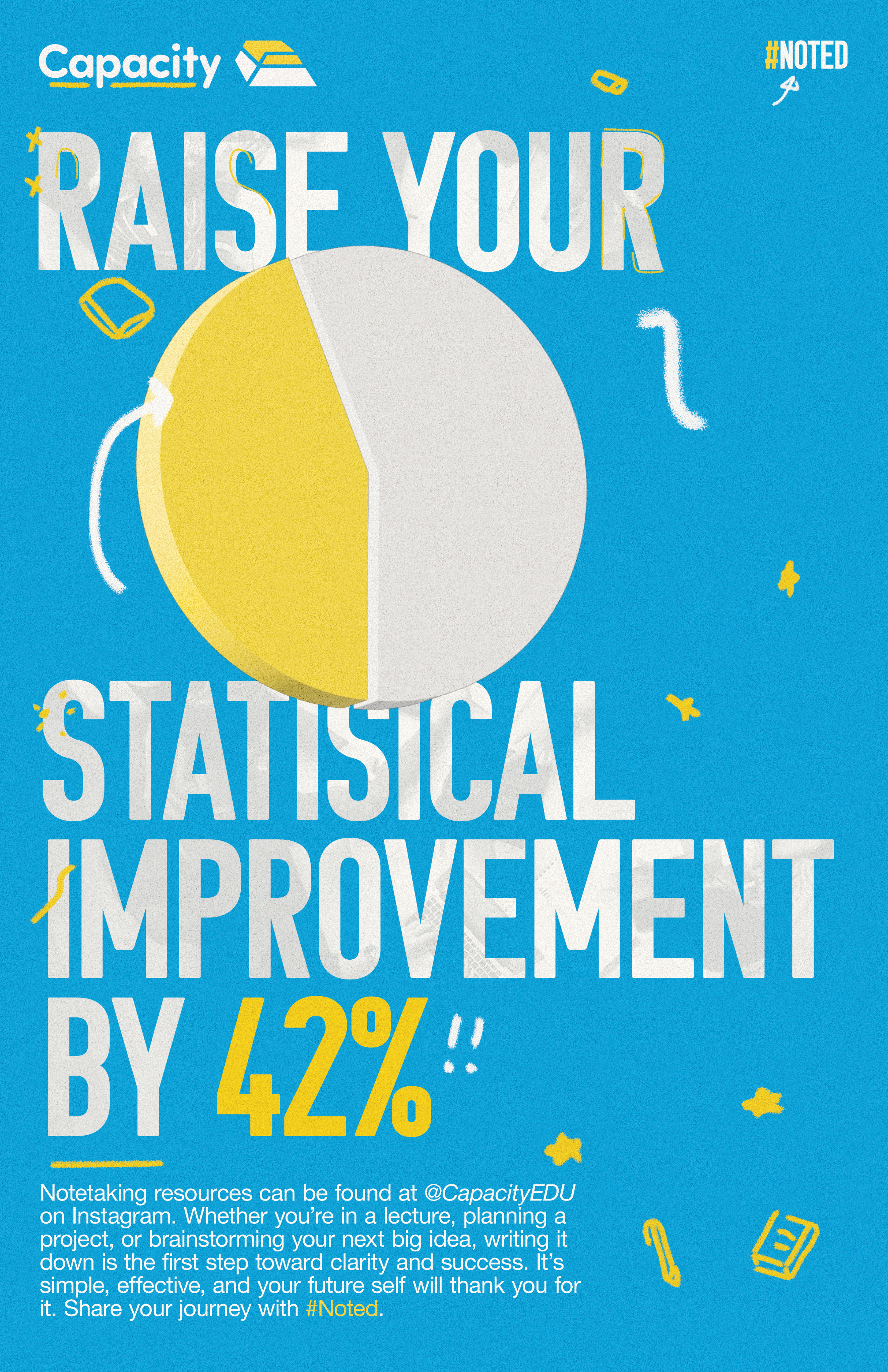
Poster Series
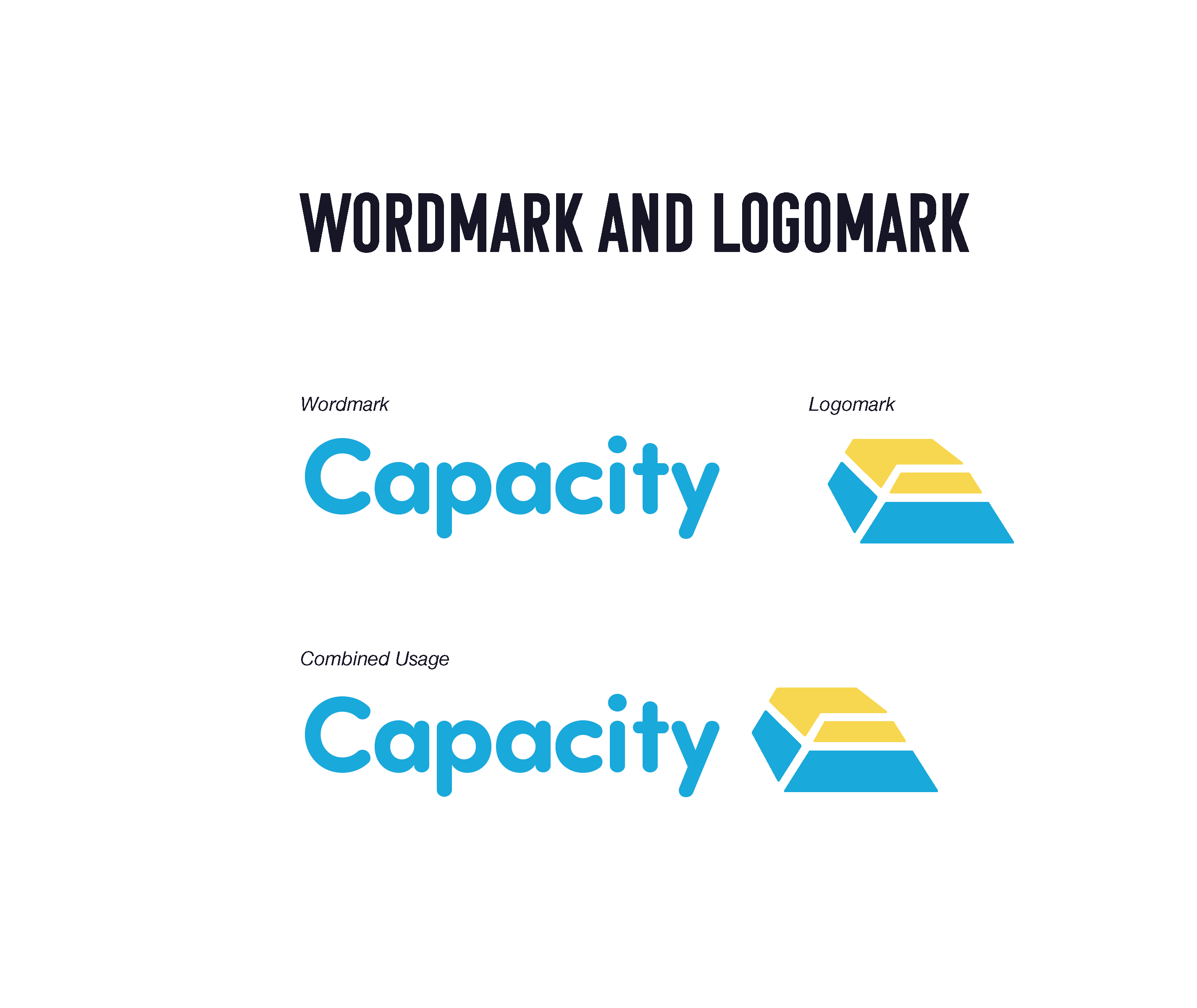
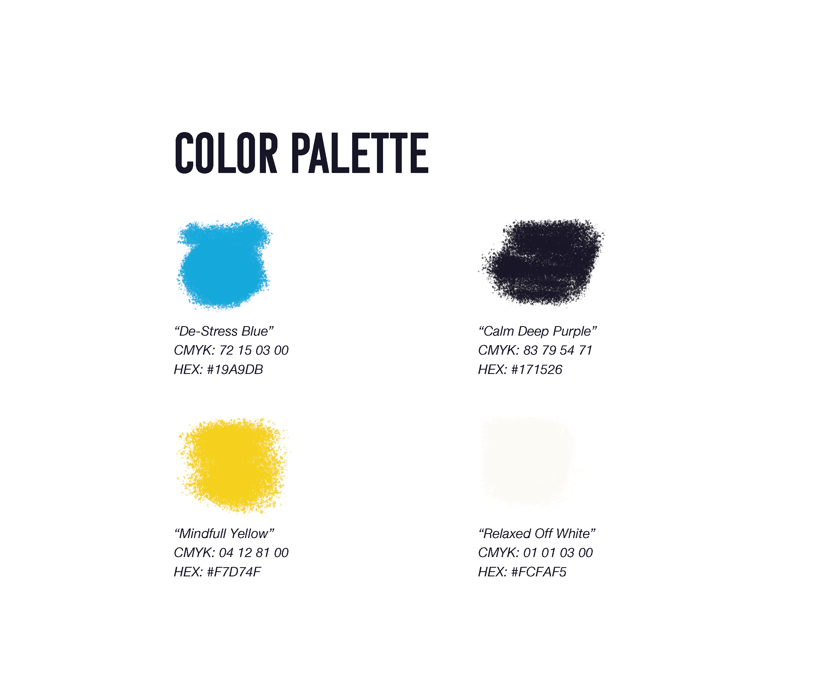
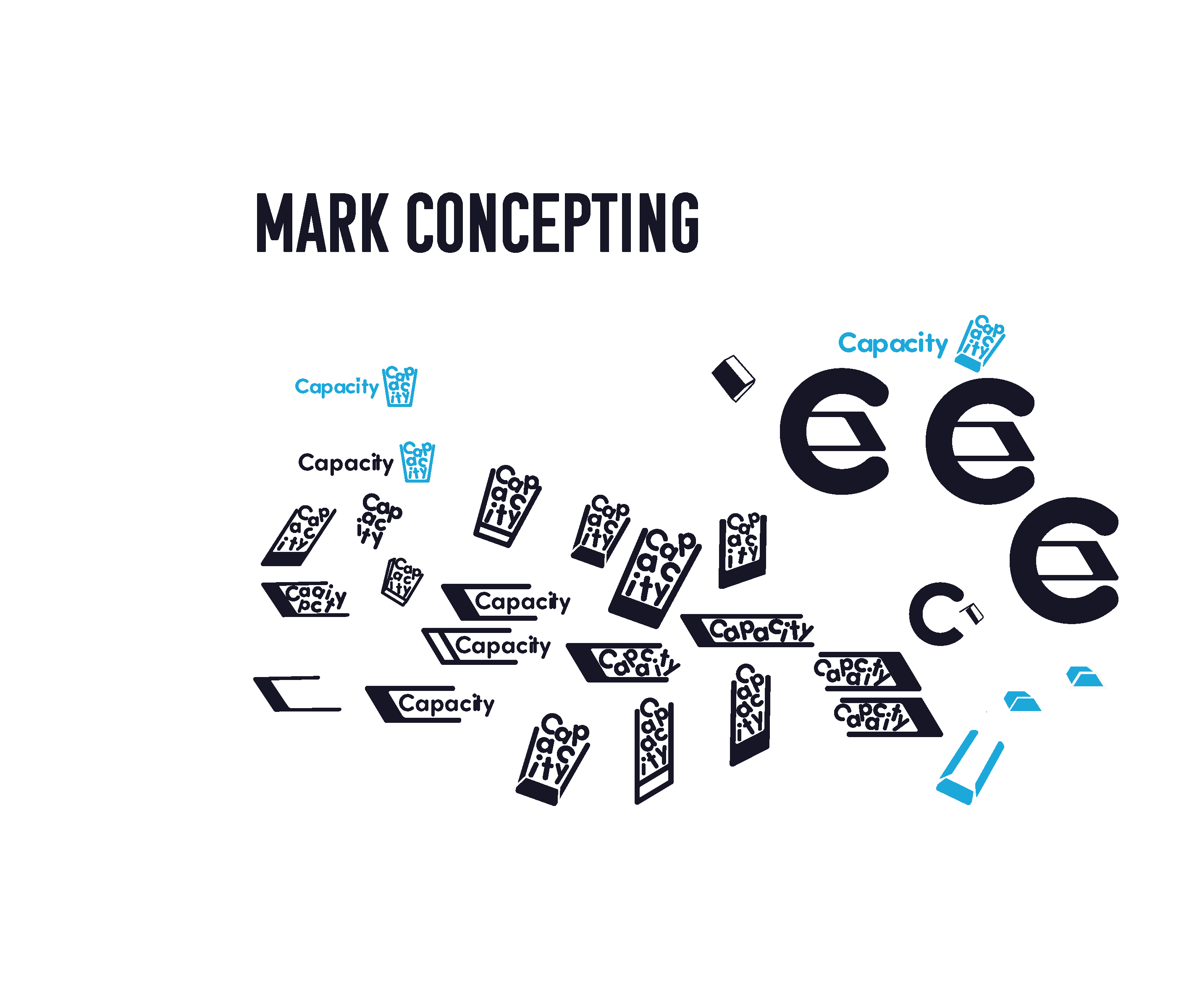
This project from a branding standpoint was a challenge largely when it came to building the proper mark. While both colors and general style were largely sorted out during my research period the mark proved to be a challenge. The goal of this project was to find a brand identity that was both accessible and engaging while also not being boring. Towing the line between something clearly meant for education but also engaging was certainly a challenge. The mark went through many iterations from being text-based to what it ultimately became by the end of the process.
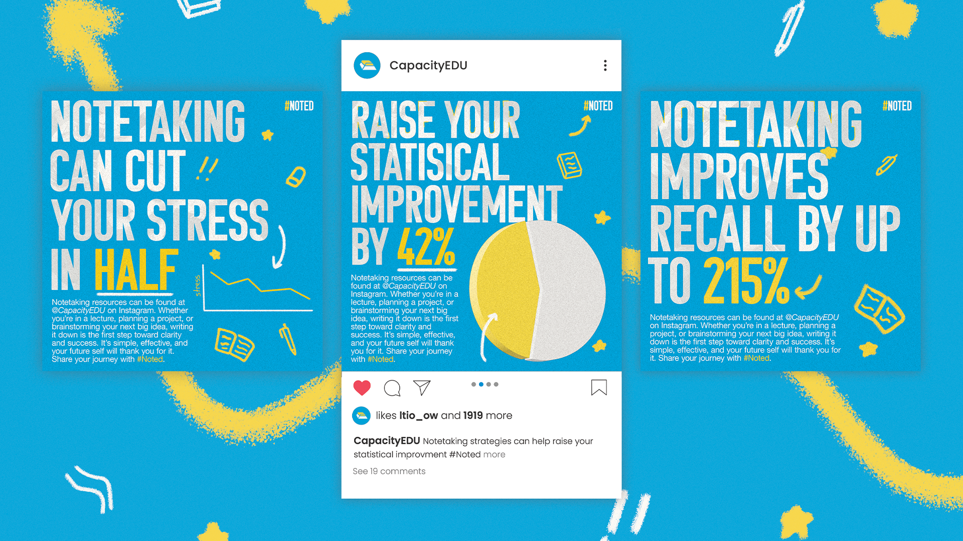
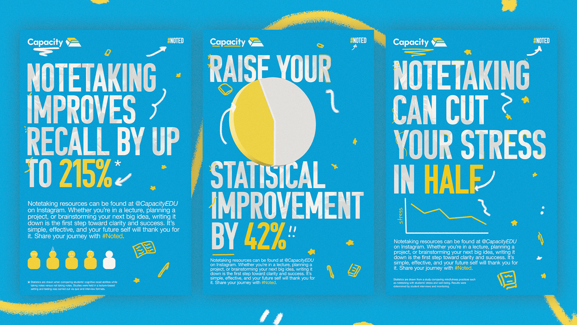
Instagram Posts
Overall while this process has been a large undertaking I can say that I am at minimum pleased with where I have ended up. Being part of the process from the very start from the conception of an idea that I was passionate about to fully researching and fleshing out a brand I believe I was able to build a body of work to be happy with. I believe having set out to build a campaign that highlights the benefit of notetaking that I have succeeded along that path. From a personal standpoint, this project has also helped shape my individual understanding of the design process specifically when in relation to the benefits that research can have on a process. I believe this relationship with design and research has helped shape my expectations of what is required when designing to address social issues as a whole.

Check out some more of my projects below!
More projects
Design
Capacity Capstone
Explore
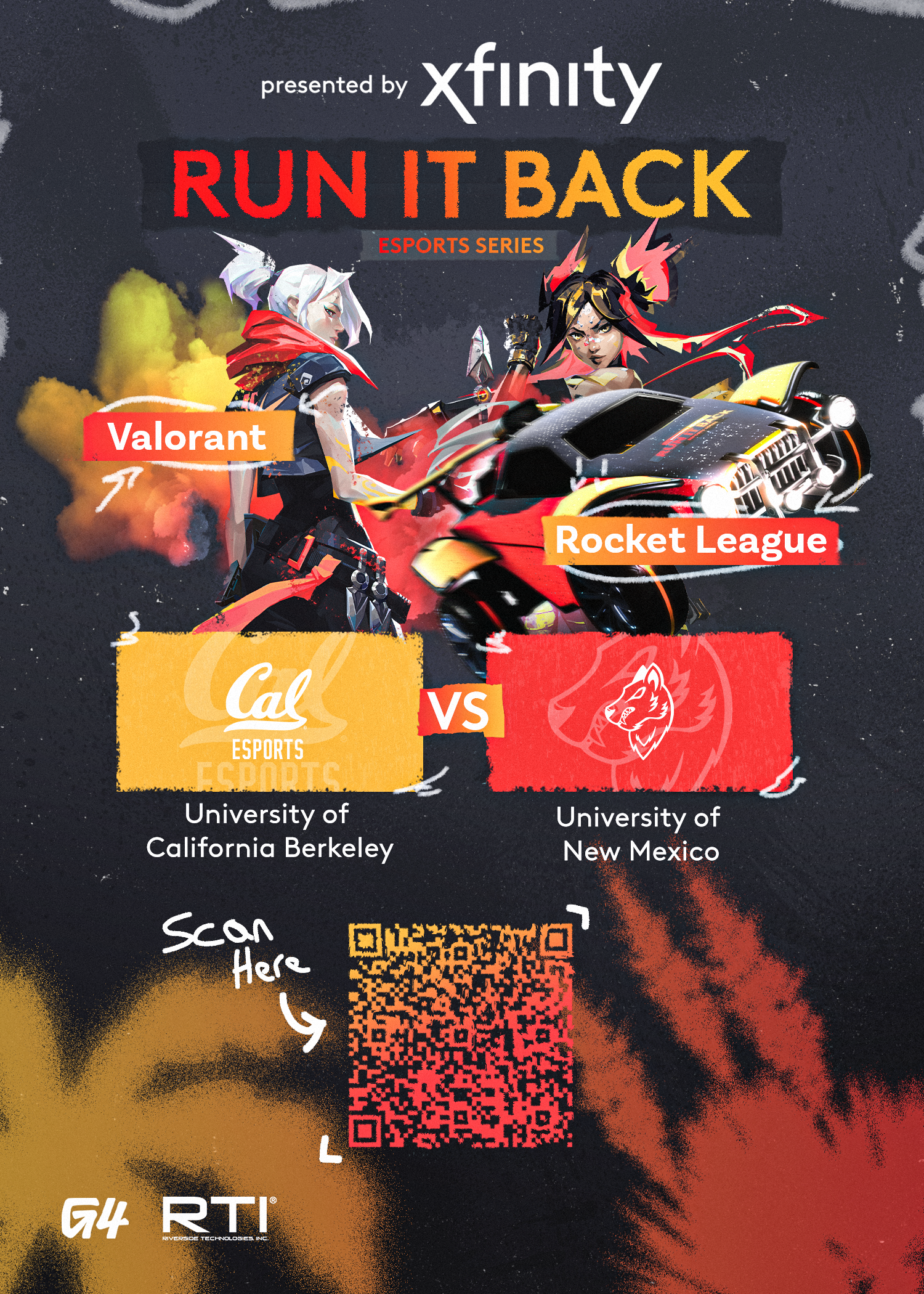
Design
Xfinity: Run it Back
Explore
Design
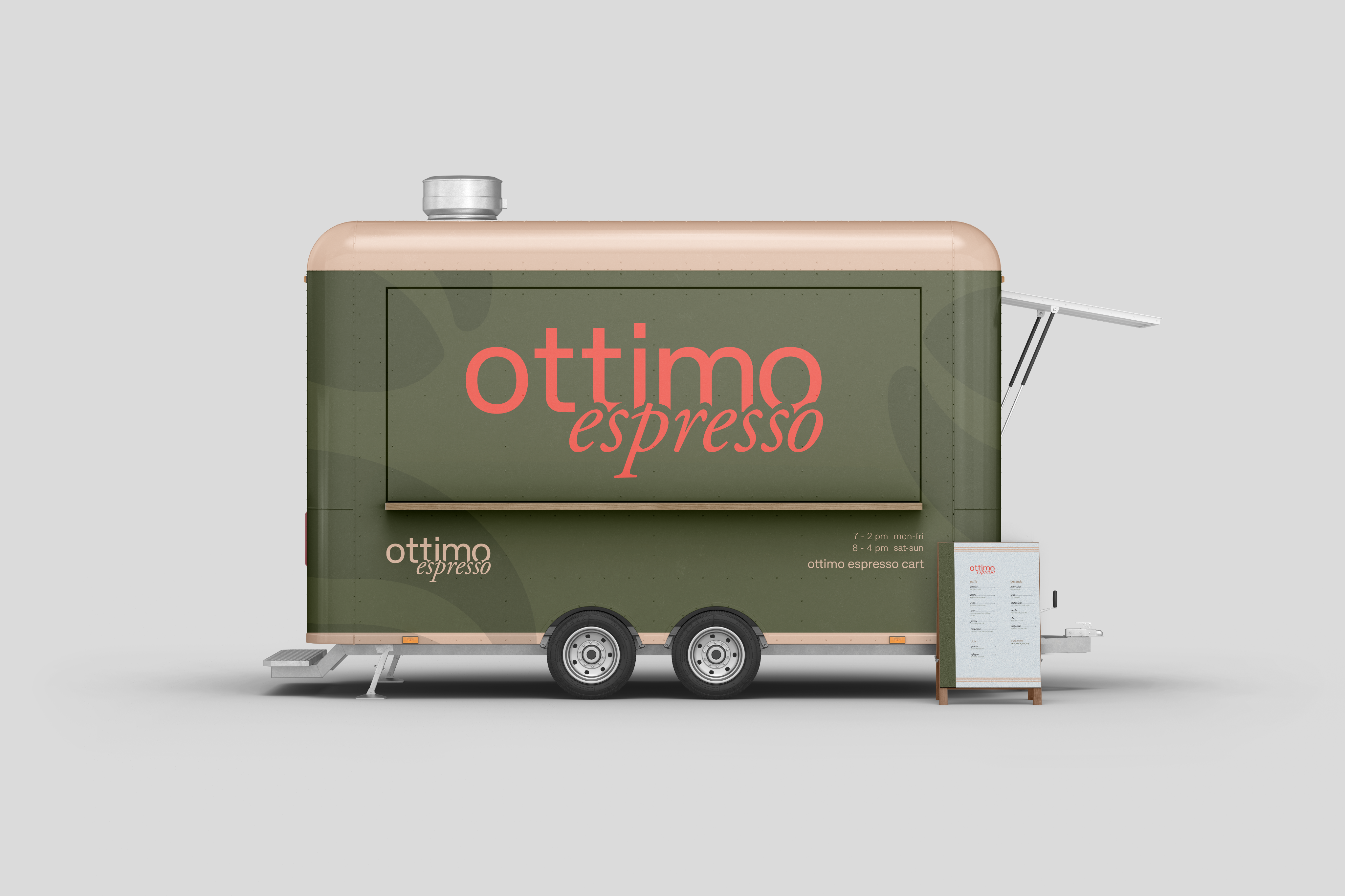
Ottimo Espresso
Explore